Sunday, May 31, 2015

A Better Understanding of Photography 2

Welcome to part 2! In this post, I'll let you know a few basic composition tips. :)

Picture this: you're in the car with your family on a road trip. You're in the back seat, taking naps, looking outside, and reading. You wake up from a nap to see airplanes taking off and landing outside. And then you look a little farther out and see the worlds best city-skyline passing by. New York City is in your view and it's the perfect opportunity to take a few pictures from the car. You think to yourself, "oh man, I have to take a picture of this!" So you dig out your camera from under your seat and take the lens cap off. The car is quickly passing by the city, so you have to hurry with the set up. Once you turn the camera on, you face the city and take a few snaps. Click click. You check out the pictures and, oops, it's too blurry. You try again and hold your camera stilly this time. Click click. You check the pictures once again and, oops, the picture is still blurry. The New York City is almost behind you now and you're missing the chance. Oops. No luck and you're bummed out. You missed out on taking great shots of New York City because you didn't know your way around the camera. 

Lesson learned from that example: LEARN YOUR CAMERA. Only then can we proceed with taking good pictures.

I know my way well enough to know which camera setting to go to for a picture. The pictures I took here are taken from the George Washington Bridge, which passes right by New York City. I used my ninja fast skills to grab my camera out, set the camera to sports mode, and clicked as many as I could. Why as many as I could? Because it's best to capture as much as possible, and delete the ones you do not want later. In this picture, I actually got upper Manhattan in view with a plane lifting through. 
 

This was a zoomed out view of Manhattan. Upper Manhattan on the right, lower on the left. For me, it's a little hard to take zoomed out pictures, like the beach or a city in this case. This is because you have to pay attention to the composition. Simply put, composition is the arrangement of visual elements. So with this picture, your subject is so small (in length), and only takes up a small portion of the entire frame. So its important that it the subject takes up as much space. For example, you don't want the city all the way at the bottom of the picture because that would leave you with a huge blank sky. So with these types of pictures, it's best to proportion the horizon to create a good composition. 

Another tip for composition would be to follow the rule of thirds. This rule splits the frame into nine squared sections, like a tic-tac-toe board. This is just a guide to help you place your subject. The goal is to not place the subject directly in the middle, but to place it on the gridlines or the intersections. Buuut, this rule can be broken. By all means, rules are made to be broken by someone, and photographers break this one allll the time. If you don't follow this guide, that doesn't mean that your pictures are not good. In fact, it might be awesome, and not follow the rule of thirds. I read this online, "However a wise person once told me that if you intend to break a rule you should always learn it first to make sure your breaking of it is all the more effective!" So, learn it and then break it! 

The funny thing about this picture is that I took it by accident. The camera was hanging by the strap on my neck and I wasn't holding it in any position. I was looking somewhere else and my right hand was just playing with the shutter release/button (the button that takes pictures) and I accidentally clicked this picture. I don't even recall taking the picture. So later, I check my pictures and I see this decent box of flowers on someone's house (or it was a store, I don't even know where I took it). But it was so perfectly centered and vibrant, I kept it. These flowers are centered very well, therefore breaking the rule of thirds, which is perfectly fine. 

Why rule of thirds? It's believed that people like their pictures better if it's not perfectly centered, and the picture becomes more balanced. I read somehwere that stufies have been done to show that peoples eyes naturally go the interesection points on a picture, whether the picture follows the rule or not. So, using the rule works with the natural way of viewing pictures. This rule works great on people Photographers generally don't like to place people in the middle, but place them on the sides of the frame. 

This rose flower from the rose bush is pretty well proportioned. This would be an example of the rule of thirds. The rose is not in the middle. Instead, it's on the grid lines. You can find these grid lines on many cameras, so it can guide you as you are taking pictures. 


Hope you learned a little about composition, and don't forget to learn your camera!

Sunday, May 10, 2015

Mother's Day 2015

Mother's day this year was pretty busy, given that it's always on a Sunday. Well this year, I woke up earlier than my Mom, and I went for a class and didn't see her again until around 1:30. Then, we chilled at home and I did my own things and she treated herself to her own things. It was at night time that we gave her her gift. This living locket necklace that I specially personalized for her. It was pretty expensive but the lockets are really fancy. It's from a website named Origami Owls, and they sell mainly lockets and braclets which you can personalize with your own charms (inside) and dangly-charm things. There's actually a MOM charm inside the locket, I guess you cant see it in these pictures. 

So the day that it was shipped, I put the locket together and I took it outside for a photoshoot. It was kinda hard to hold the necklace and take a picture with the other hand. And I almost got caught by my mom as well. I was by the front door, and she suddenly opens the door to check on me. I panicked and hid the locket in my pocket. Luckily, she didn't see it and thought I was taking picture of the trees or something, haha. Anyway, I wanted a background that'll contrast the colors of the locket really well. I admit this tree's deep color (what color would you call the tree??) didn't match the locket. I did use the 2/3's rule and placed the locket on the right third. 

This was the second picture, which a different background. This flowery background matches the locket better than the other, in my opinion. The girly colored theme is set; the pink, red, and white colors. Even the silver and the stones on the locket matches too. For this picture, I didn't use the 2/3's rule because I hung this on a branch and took the picture. It kept swining around, so I had to quickly take a picture. If I had the chance to take this again, I would have pushed it onto the left third. Oh hey, you can see the MOM charm a little here. It says MOM, not WOW. ;)

Thursday, May 7, 2015

First Look at the Night Sky

This was actually my first attempt at taking night pictures. After reading the manual, I got an idea on what the camera setting should be at. A tripod is recommended for taking night shots, so I went to look for our tripod. Then found out that our screw thing, the piece that attaches the camera to the tripod, is missing. So I used my resources and tumbled out the door at 10:45. The sky that night was pretty bright. The moon was a waxing gibbous, which is 11 days old and 4 days away from a full moon. It was rather cloudy that night. I call it the Halloween skies because the moon kept appearing and disappearing like it would on Halloween.  

The first picture was the first one ever and it was a tester of the camera setting. I was instantly shocked because you can actually see how bright the sky is! What I was really going for was to see the entire moon, but I was standing on the sidewalk with no shoes. I didn't want to go on the grass barefoot, so I went as far out on the sidewalk. That's why you just see the light of the moon peeking out. 

This was from my backyard. I got a better view back there and I was really happy because you can see like every detail of the sky. If you look closely, the picture is really grainy and looks old. I think if I get the settings on the camera right, it won't look so bad. 

I recommend you do not use flash at 11pm at night. Bad idea. Well being new to the idea, I tested out the option of flash. I took a bundle of pictures without realizing just how bright the flash was. It lit up like the entire front of the house. It might have disturbed the neighbors, but I dont think it went that far. I apologize though, neighbors. If you noticed in the picture, there's a a weird red flare on the edges, and I edited that in along with the filter, just to make it look cool. 

This is the same picture as the one above, but I edited this on the iPad using some app called sketches by tayasui. I edited the original picture, the one without any red flares or filter. 

Pretty fun for a night experience. Actually, I saw a cat in the beginning, which completely look me by surprise. I tried to take a picture of it but it was too dark and there wasn't enough light. By the end, there were some sorts of creaking noises too, but I know it was the wind making random noises. Even though it got really spooky near the end, it was worth it. Next time I go night hunting, i'll try to go when the stars are out and take some star pictures. 


Tuesday, April 21, 2015

Scale the Car

Do you ever go back to the basics? In anything? Maybe go back to how to do something again? Yea, well I did for photography. I realized I needed to read about my camera so I took a looong skim through the manual and read over the different options and effects and everything. Along with that thick book came a thin booklet on ideas for photography. So after reading the booklet, I got inspired. The booklet had a wonderful trick. It had a really clever, misleading trick, and I fell for it myself. So after reading the booklet, I got inspired.

The trick was that you place a toy car in front of a physical picture, like a book. Well a fancy looking car in front of a nice background. The booklet had an example of a yellow car on a gray platform (which looked like a road) in front of a picture of some hills. Then place the car to fit the background (to make it look like the car is a part of the picture). Then you angle yourself the right way when taking the picture. The toy car in the booklet looked so real!

I tried something like that myself and this builing background was so hard to find! It's actually from a cookbook, and this toy car isn't even ours. One of our friends left it at our house years ago and it's been parked around the house for so long. Finally, it has a use now. The only thing wrong is that the car isn't scaled to the background. But, I used my creative mind to think that the building is just overly large compared to the car. I put this picture in black-and-white because the picture looked fake with color. The light reflected off the page and the green car looked really out of place. 

This is also using the same idea.  This background picture was actually from a photography book that I received. It's a really good book about a photographer telling the funny and odd stories around New York City. I looked for other pictures in the book that would be good for a car prop but I couldn't find anything suitable. It's hard to find a picture that is least a page wide. Anyway, did you notice the car in this picture? The trick to this picture is make it look like the car is a part of the picture. But the car is oddly placed too because you can see the 2-D cars in the picture. But, you get the idea. I made this picture black-and-white with some color because of the page reflections again. The light bounced off the page and highlighted certain areas.


Sunday, April 19, 2015

Soccer Goals

Saturday April 18th was my sister's first soccer match of the season. So instead of chilling at home, I tagged along and my cousins also came too. She had team pictures at 8 am, and her match started at 9. Her pictures were over by 8:15, which left 45 minutes of waiting around until her match at 9. Good thing I brought my camera because the wait time was a great time to pictures. It was relatively warm and the sun was starting to dry the dew. In those 45 minutes, her team prepared for the match with warm-ups and things, which left my cousins and I bored. There were other fields around the place that were empty, and since my cousins are soccer players too, they practiced some soccer. Which left me to myself. Making myself useful, I went around and took pictures of my cousins in action. 

This was the white, spray-painted end line. I guess there's nothing interesting about this picture except its structure. There's always talk about the 2/3rds rule. That rule says that you shouldn't place your subject directly in the middle. In this case, there's only one subject. I thought about the 2/3rds rule when I took this picture but it just didn't make sense. If the white line was off center, it would make the picture unbalanced. Therefore, I tried making the line as symmetrical in the picture as I could. 

The classy soccer ball picture. You can easily identify where the source of light is coming from in this picture. (The sun is shining on the left.) But theres an unecessary shadow on the left side. I think that's the head of my cousin, which could have been easily avoided. 

The final picture. The final goal. This was of my cousin scoring a goal. Actually, it was a practice goal (since they were just playing around, one was goalkeeper and the other was scoring).To me, this is a great shot because the lighting makes the shadows visible. And if you are paying attention to the shadows of the ball, it is positioned to confirm the ball is in the air. The field of depth is great because it cuts off right behind him. And it would've been better if he was wearinng his cleats, but that is understandable to me because he just came to watch my sister's game and didn't know he would be playing around. 

I also got a great shot of my sister during her game. It was of her sprinting with the ball with no one around her. So photographically, it was a good picture because there weren't any players around to distract the audience from the subject. I showed it to her after the game and she loved it. Her hair was flying and she was in a great position. Sadly, her team lost that first game of the season. Oh well, there's always next time. But, not always with photography. :)

Friday, April 17, 2015

Layered Gardens

Ever since a trip to the Apple Store at the mall, I've been experimenting with this one app called Afterlight. The whole episode started off when I was looking for a good app to edit pictures conveniently on an Apple device. We went to the Apple store for other reasons and after browsing on the iPad's, I coincidentally found the "perfect" app. When we came back home, the first thing I did was look up the app and install it. I played with it for a good half hour that day. There's so much to do and so many looks you can give your pictures. Afterlight can edit the basics of the picture, place filters, and even add on other cool effects like light leaks or layering pictures on each other. I highly recommend it as a picture editing app. So these pictures (the same ones that are in my previous post about Longwood Gardens) are the results of some editing I did using Afterlight. Three of these pictures below are used with a technique called layering. Well, I call it layering. It basically means that you take one picture and make it transparent. Then, you stick it on top of another so that you can see both pictures (one transparent and one as the orginal). It's like a two in one package deal.


I had a vision that the purple flower on the left could shoot for the stars. There's so much that can be done with it. So many filters, so many ways to edit the lighting, and so many ways to enhance it by changing the color. I took the purple flower and layered on a picture of the gardens right on top. I was looking for a picture that was full and completely busy. (It would look odd if I had single flowers layered on top.) This garden picture was the perfect one in my eyes, and I used the app to just layer it on. Afterlight let me choose how transparent I wanted the second picture to shine through. After going through the options, making the gardens less visible on the purple flower looked better. After all that, I quickly fixed the shadows, exposure, highlights, temperature, contrast, and clarity.

I changed this picture in afterlight as well.  I did a little more than the previous picture though. So, my intention here was to get a reflection feel. As if you were looking through a glass and seeing a garden as well as the reflection on the glass of the garden right behind you. On the final image below, the top half is a better representation of what I was going for. So I layered the picture on the right, right on top of the one on the left. I placed it on softly, not making the flowers look too rigid against each other. Then, I tweaked the exposure, highlights, sharpness, shadows, clarity, and contrast. After that, I went into the light leaks option, and chose one that was on the corner of the picture. Light leaks basically adds fake sources of light into the picture. In this picture, it is on the left corner, which is brighter than the rest of the picture. I guess it justs adds to the whole confusion of the reflection idea
  

These two pictures are so similar in structure. The long stalks of flowers, the darkened edges, and even the background is uniformed. I really wanted to mess around with the left image because of the vivid pink, so I scanned through my options and decided to layer it with a similar picture. After layering it on, I realized the whole flower part is confusing to look at. It looks like a breed of some weird flower, but then you see some spooky shadows in the back and the right side of the picture is unclear. 

At this point, after layering on three pictures before, I decided to just play around with the different filters and the whole lighting/color of the picture on Afterlight. The original has a better portrayal of the different color schemes on the flowers. Pink in the front, purple in the middle, and blue all the way in the back. On the app, I first picked a filter and then tweaked the shadows, highlights, etc. After playing around with it, the entire picture looked so different. In my opinion, the new picture looks better by itself, without comparing it to the original picture.

Friday, April 10, 2015

Trip to the Unbloomed Gardens

Unbloomed gardens? Yet here I have pictures of flowers? Odd or what? Well, don't judge before you get the whole story. We took a trip to Longwood Gardens, beginning of April, and it was just empty outdoors. Well what else would you expect? April showers bring May flowers. So of course there are not going to be any flowers shining up through the soil yet. Oh well. We visited indoor conservatory and that was stunning.  And with natural instinct of holding a nice camera, I took plenty of pictures. I narrowed it down to about a dozen here. 

These are some orchids. I actually looked up the name of these up. These are called, phalaenopsis orchids. I found out that orchids are pretty hard to take care of with so many conditions for it to live under, but they can live for a while. These look so delicate and even the color is great. The way the veins are highlighted in a brighter pink on the lighter colored petals. And this was taken indoors in a large conservatory, a room filled with other orchids. There were pots and pots of so many varieties from all over the world. It was quite a sight.

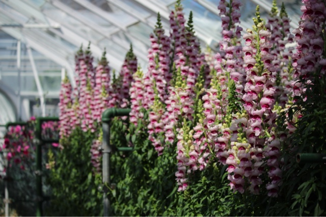
This was in the greenhouses as a part of the conservatory. I don't know if they were planning on potting these somewhere, since its so early in the season, but it would look great if they were to. The gardeners can create some creative gardens with the height of these plants. The focus of the flowers on the picture self is really weird. The focus is on the flowers all the way on the right. It's different because you expect to see it around the middle of the picture. And the focus being only on the right hand side makes the rest of the picture out-of-focus/blurred. I think it's cool because you don't normally see that and the goal is to draw your audience to the look at the entirepicture.

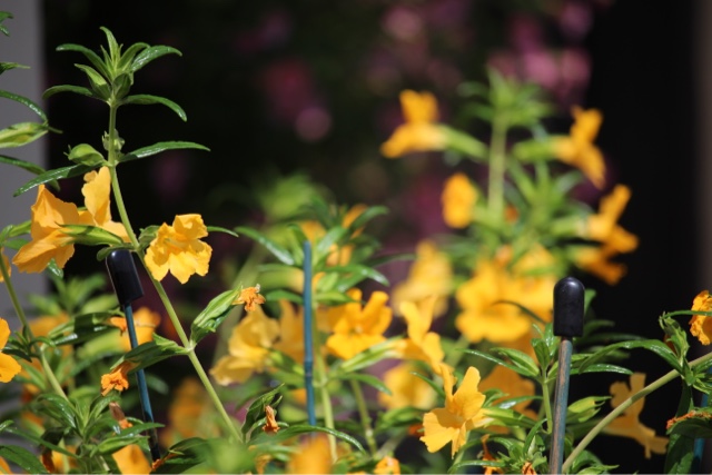
My first intention for taking this picture was that it would make a decent background picture. So I angled the camera, myself, the flowers, and even the background according to how I wanted the picture to be on my screen. I had to choose the background: either a concrete gray, or this black one with some pink flowers in the distance. I chose the black because it makes the flowers stand out in contrast, although, the lighting could've been better here. Also, note that these are all decisions that take seconds for me. The time it takes for people to make decisions on these may vary, depending on how important the picture is to them and how they want to perfect it. Don't worry though, I don't stand there for minutes, debating on which angle I want to take the picture, all for a background. 

This next flower is one I adore alot. It's just so clear and the light falls just right and the background contrasts the flower so well and the flower itself is really pretty. I think this tops the previous picture, background wise.

Bonsai! Yea, Longwood Gardens have a row of Bonsai's. There was a small issue with the picture taking process though. I didn't want to take a picture of every single tree. What would I do with a shot of every tree? I did want a clear shot of at least one though, but I then I felt bad for not taking pictures on the other ones because I'd be missing out on the coolness of the other Bonsai's. So what better way to take it? Solution was simple. Take a picture of the entire row, with focus on one, followed by the other behind.

Gardens??? Yea, these were all indoors. The gardens inside are there year-round. Although, I think they change it seasonally, so I they might have changed it just recently, but i'm not 100% sure. The gardeners or whoever designs the gardens really do a great job. The colors and the variety they include in each section is a job well done. Just in this picture alone, there are 8+ varieties of flowers.

Aren't the hues on these flowers unique? There were hundreds of flowers in the conservatory, but I didn't see a single one that was shaded this orange-pink-purple. Just admire how picturesque and flawless this flower is. No gaping holes in the middle from insects or wrinkles. It looks really healthy.

I really find the color scheme in this picture to work out so well. And I don't know if it was on purpose or not, but the color of the flowers and the trees behind match up so well. Another thing was the focus on this picture too. I took this at a far distance, so it automatically focused on the first line of flowers. It makes the other flowers behind look painfully blurry. Also, it's really frustrating to see that the tops of the flower are cut off . It would look more...complete if the tops were stuck in the picture.

These flowers look good in the spotlight. And the way the background blacks out is because i'm standing at a greater distance. It all depends on where you meter your shot since cameras have lower contrast ranges. And I'm not so sure what kind of daisies these are, but they are daisies for sure.

Again, with the color scheme in the gardens. The pinks and blues and purples work so well.  The depth of field turned out to work just fine. The focus line cuts off right where the flowers change. So, only the pink and blue ones are in focus, while the purple and the taller ones all the way in the back are out of focus. And the tall flowers in the back are outlined from the light, so it was included into the entire view. 


So... I guess the gardens did bloom.. as you saw in those picture, but once spring actually comes around, the flowers and trees outside are going to look awesome.  We saw rows of tulips starting to sprout and trees starting to grow leaves outside. Maybe we should go again in May to see the difference.